Saturday, February 18, 2012

The Ricardian method

The so-called Ricardian method has become quite popular in the last ten years as a way of trying to estimate the potential damage (or gains) to agriculture through climate change. It is usually a cross-sectional regression on land values (price of land per hectare or rent per hectare) and a bunch of exogenous variables. Records such as past wheat yields aren’t included. Then we can measure the impact of a change in a variable such as temperature or precipitation. Control variables, such as strength of the local economy are usually added.

I’ve been doing the same with the arable rents for the southwest of England in the early 19th Century, but with recent meteorological data. There were no weather measurements taken then, and even if climate change has occurred in the period between 1835 and now, the change is likely to have been relative. The regression output is below, but here are some interesting points:

I include variables of interest, such as MARAIN (March rainfall) with their squares. That’s because there is a non-linear relationship. So for March rain, the regular unsquared variable has a negative sign, while the square is positive. The result of the combination on arable rents is a upward curve, meaning more rain was good in March. That is true: farmers want water in the ground to get the plant through to the summer.


But look at July rain. The signs are the opposite way round. The result is a curve, shown above. The recorded range of July rainfall in mm is on the x axis. The y axis is the rent. Some July rain is good, but then at about 52mm, that’s enough, thanks. The plant gets waterlogged and the forthcoming harvest is ruined.

Days of airfrost is fascinating: see the positive sign? Farmers wanted more days of airfrost back in 1835, because that is what killed the pests. No Roundup etc then. For soil, I put in dummies for different levels of clay. The negative signs mean that more clay lowers the rent. This seems counter-intuitive until one realises the connection with rainfall. Heavy clay soils tend to hold the water, generally good, unless you farm in a poorly drained area. Much of the southwest was just that. 


Friday, February 17, 2012

Agricultural production functions

Different types of agriculture have different manpower needs---at least they did in the early 19th century. For a farm of any given size, less workers are required for livestock than for arable. Arable requires a lot of labour for sowing, weeding, harvesting, threshing and all the rest of it. So we might expect to see the number of workers per farmer increasing with an increasing share of arable. Now, here is the interesting thing. The ratio between arable and livestock changed with proximity to London, at least it did from the perspective of the southwest of England. The closer the farm was to London, the more arable. Cornwall, Devon , Dorset and Somerset were heavily into livestock.


So, how about we plot the ratio between arable and livestock against distance from London AND the ratio between number of labourers to farmers?  I have used lowess smoothing to get a single trend line from a mass of points. I have to say that I was really deeply surprised by the closeness of the two lines. And the best thing is that the data sources were entirely independent. The farmer to labourer ratio came from the 1851 Census records, and the arable to pasture ratio came from the 1836 Tithe Commission Files. The 'kink' at around 200km from London is the beginning of the heavily pastoral country, eastern part of Somerset. 

Wednesday, February 15, 2012

Von Thunen and intensification

JH von Thunen was a German farmer and economist who lived about 200 years ago (which makes him even older than me!). In the Devon rents paper, we successfully tested his theory that rents decline with distance from the market. He had another, less well-known theory. He argued that the intensity of agricultural production would increase the closer the farm was to the market. The rent would be higher, and so the farmer would 'work' his (or her!) land harder.

Amy and Malcolm,  you helped me to calculate the ratio between farmers and agricultural labourers, using data from the 1851 census. I built a shapefile using the locations and the ratios and then 'kriged' the shapefile to get an interpolated surface. I put the ratio values for each location into the observations for our 609 parishes in the southwest of England. Finally I plotted the ratio for each parish against its distance from London. The result is the graph below.


Isn't this fascinating? You can see quite plainly that the ratio decreases with increasing distance from London. The farmer employs less labour the further away he is from the market. The furthest distance represents Cornwall at the extreme west. There the ratio is very small, so probably most of the farmer's family were involved in work on the farm. Looks like von Thunen was right!

Wednesday, February 8, 2012

Direction for the railways paper

The focus of the ‘railways’ paper is a quantification of the amount of money saved by agriculture.  We are going to try to calculate the savings as a share of Gross National Product in the years 1850-1870.  Some previous studies (e.g. Hawke, 1970) conclude that the savings made by farmers using railways are “insignificant.”  Let’s test this!

Our methodology

1.      The graph shows the coefficient of the regression of rent against track length.  The coefficient provides the rent-per-acre increase for every extra kilometre of track within 40 km. of the estate.  The landlord is “extracting” this amount, equal to what the tenant farmer saves by using the railway.

2.      If we multiply the coefficient by number of acres by the length of track (year by year), this will give us the total amount saved. For example, take the year 1860. If a landowner had 1,000 acres, and in (say) 1860 200 km of track became available, then he would be able to gain an extra 1000*200*0.0002 = 40 pounds for that year and going on into the future. (I got the 0.0002 from reading off the graph).  But the point is that this saving is cumulative. We could (and we will!) go back to 1850, find the savings and then add that to the saving for 1851, and so on. The landowner gets the cumulative savings year after year. 

3.      At this point, we don’t care whether it was the landowner or the tenant who got the money.  It was saved, that’s enough.

4.      The result from paragraph 2 gives us the savings for our estates – now we need to extend this to the whole country.

5.      This isn’t too hard: Malcolm and I can calculate total track year by year, and Amy and I can find (where?!) total amount of pastoral land and cattle.

6.      The next step is to divide the total savings by the yearly GNP.

7.      Trying to get this done by the end of February!

Monday, February 6, 2012

1835 Wheat prices in colour!

I was looking for wheat prices in 1835 at a local level.  The 19th century farmer sold his wheat production locally, so the local price was important.  We know the historical prices in London of course, but not throughout the country.  And it is the regional differences we want to find.

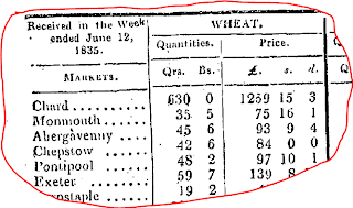
Here is how you -- Amy and Malcolm -- solved this data problem with me.  I approached wonderful Mary L. at UBC Library who is an authority on government data.  She found that wheat prices were published in the London Gazette at the market-town level.  That was enough!  A clip of a bit of the data source Mary found is here.

I selected 76 market-towns from the several hundred provided.  Malcolm got the geographical coordinates.  Amy put the old weights and money into shillings per quarter.  Using ArcGIS I built a “surface” with wheat price as the elevation.  The result is here.


You can see that wheat was cheaper in the Midlands and eastern counties, where it was grown.  Around the Southwest and London it was much more expensive.  Transport costs and demand drove up the price. This result isn’t really that much of a surprise – but how else could we have actually shown that what economic theory suggests actually takes place? And then, using ArcGIS I got the wheat prices at the highly localised parish level into the dataset...and guess what, it worked. So thanks Mary, Amy and Macolm.

Railway distance coefficients...a surprise!

The “Devon Rents” paper is pretty much done – the theory written up and the empirical section completed.  Now on to completing the Railways paper. 

Malcolm calculated kilometers of track and Amy worked on the rents for 25 estates over the period 1832-1870.  We found that an increase in track increased the rents – why?  Because the tenant farmer saved money by using the railways to take his cattle to market. However, he didn't get to keep the money. Those savings were “extracted” by the landowner as higher rent.  This is exactly what economic theory would predict.  So what’s new?


First, I plotted the coefficient of the length of track variable in the regression against time.  I found that the coefficient decreased over time. You can see this from the graph above. This means that for every extra kilometre of track, the landowner extracted a smaller amount year by year.  Why should this be?  Suddenly being soft-hearted?  I don’t think so! It’s more to do with competition among the railways.  They dropped their rates and so there was less to be extracted.  The graph shows it all.