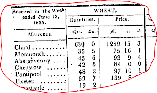
I was looking for wheat prices in 1835 at a local level. The 19th century farmer sold his wheat production locally, so the local price was important. We know the historical prices in London of course, but not throughout the country. And it is the regional differences we want to find.
Here is how you -- Amy and Malcolm -- solved this data problem with me. I approached wonderful Mary L. at UBC Library who is an authority on government data. She found that wheat prices were published in the London Gazette at the market-town level. That was enough! A clip of a bit of the data source Mary found is here.
I selected 76 market-towns from the several hundred provided. Malcolm got the geographical coordinates. Amy put the old weights and money into shillings per quarter. Using ArcGIS I built a “surface” with wheat price as the elevation. The result is here.
You can see that wheat was cheaper in the Midlands and eastern counties, where it was grown. Around the Southwest and London it was much more expensive. Transport costs and demand drove up the price. This result isn’t really that much of a surprise – but how else could we have actually shown that what economic theory suggests actually takes place? And then, using ArcGIS I got the wheat prices at the highly localised parish level into the dataset...and guess what, it worked. So thanks Mary, Amy and Macolm.


2 comments:
Quite a contrast with what I'm finding on wheat production in England at present, where lucrative places include Norfolk down to Kent, and North Yorkshire down to Cambridgeshire
Thanks Malcolm---this contrast is exactly what you would expect. In the 1830s the Corn Laws restricted wheat imports, and the country had to be self-reliant in wheat. So demand in one place had to be satisfied by carting wheat from another place. Therefore the transport costs had to be added. Nowadays transport costs are tiny, and there is a relatively open market.
Post a Comment